On this page
I’ve been drawing and selling fonts since 2018, and signature fonts are the thing people buy from me most. Brittany Signature, our best-seller since 2019, is in more than 1,300 orders on our own site alone, mostly from photographers, beauty brands, coaches and small shops that want a logo that looks hand-signed. It’s also still the font that sells best for us on Creative Fabrica.
So I have strong opinions about what makes a good one. This list has 12 fonts from my foundry, Creatype Studio, and 13 from other designers, several of them people I know from years of selling on the same marketplaces. Every pick says what it’s best for and what the license covers for a logo. Our own fonts have a live preview, so you can type your name and see it before you buy.
QUICK PICKS
Prices are for the basic desktop license, checked in October 2026. Creatype Studio is our own foundry. We’ve marked those fonts, and we only included them where they fit.
What makes a good signature logo font
Something I see again and again: a signature font that looks amazing on its cover image can look ordinary with your actual name. The designer picked the cover words because they flatter the font. Your name doesn’t get that choice. When I pick fonts (and when we draw our own), I check five things:
- Readable capitals. Your first letter does most of the work in a signature logo. If the capital is a mystery shape, the whole logo is.
- A believable rhythm. Real signatures speed up and slow down. A font with every letter the same width reads as typed.
- Strokes that survive small sizes. Hairline-thin fonts are beautiful large and disappear on a phone screen or a small label.
- Ending strokes or swashes. A long tail under the name is what makes it look signed. Check the font has them, and that you can reach them.
- A clear license for logos. It doesn’t matter how good it looks if you can’t trademark it.
Brittany Signature
by Creatype StudioOur best-seller, and the font we’re asked about more than any other. Brittany has a fast, inky stroke with sharp turns and a strong slant, so it looks like someone actually signed it with a pen. The capitals are big and confident, which is why it works so well for a first name or initials.
It’s at its best for photographers, beauty and fashion brands, and coaches who brand themselves by name. Keep it at a reasonable size. The thin connectors get delicate below about 24 pixels tall.
Photograph Signature
by typeline studio
Photograph Signature was made with watermarks in mind, and it shows. The strokes are thin and quick, with a pen-style lowercase alternate that makes names look like an autograph on a print. Its free demo has been downloaded millions of times, so you’ll recognize the style.
That popularity is the one catch: it’s everywhere. Use the alternates and adjust the spacing so yours doesn’t look like every other photography watermark. Also on Envato Elements.
Gistesy
by Creatype StudioGistesy is our second best-seller and the calmer sibling of Brittany. The letters are narrower and more even, with tall loops and a softer slant, so names look elegant rather than rushed.
It reads well at smaller sizes than most signature fonts, which makes it a good choice for product labels, hang tags and packaging. Pair it with a light sans serif in capitals for a boutique look.
Autography
by Hendra Pratama
Most signature fonts lean hard to the right. Autography stands up straight, with smooth, calligraphic shapes, which gives it a calmer and more polished feel than a scrawled signature.
That makes it a good fit for consultants, architects and anyone who wants a personal logo that still feels a little formal. It’s also on Creative Fabrica if you’re already subscribed there.
White Angelica
by Creatype StudioWhite Angelica has the loosest flow on this list from our foundry. The strokes are thin and the loops are long and relaxed, so it feels personal and soft rather than sharp.
It suits wedding planners, florists, lifestyle bloggers and anything where “warm” matters more than “bold.” Because it’s so light, give it room: it looks best large, on a plain background.
Southampton
by Creatype Studio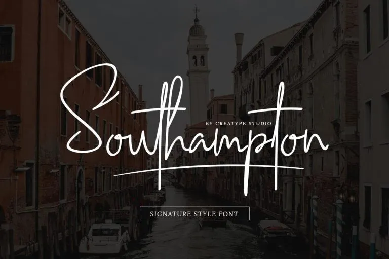
Southampton is one of our oldest signature fonts and still one of the most distinctive. The ascenders are very tall, the crossbars stretch far beyond the letters, and the whole word has a dramatic, almost architectural feel.
It’s a strong choice for a name that needs presence: a creative studio, a musician, a personal brand on dark backgrounds. Short names work best. Long ones can get busy with all those tall strokes.
Holland Signature
by Lettersiro
Holland Signature is a modern script that’s elegant without being fussy: slanted, clean strokes and a calm rhythm. It comes with ligatures, stylistic alternates, initial forms for the lowercase and a swash for word endings, so you can shape a name instead of taking the default.
Lettersiro made it with photography, signatures and branding in mind. On MyFonts the license is the foundry’s own, so check its logo terms before you buy. The two-style family is $39.
Cervanttis
by Creatype Studio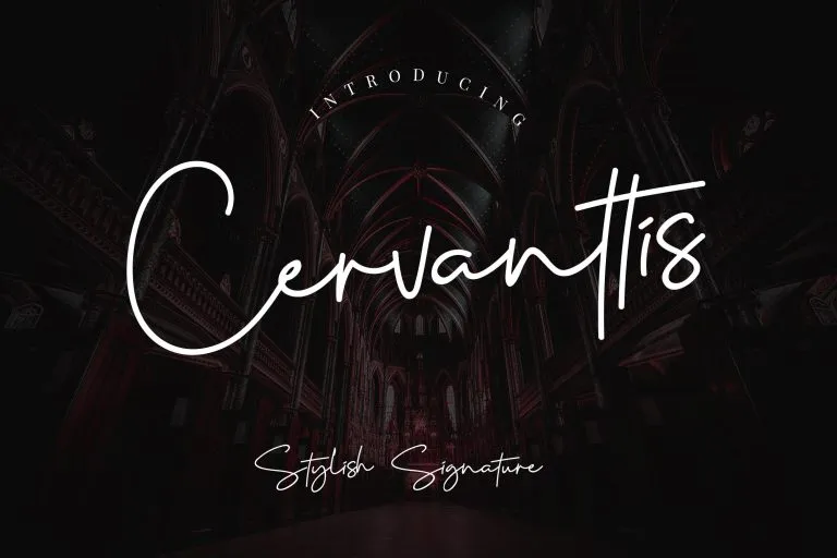
Cervanttis has some of our most expressive capitals: big, open loops that make a single initial look like a mark on its own. The lowercase is quick and natural, with crossbars that reach across neighboring letters.
Use it when the first letter will carry the logo, like a monogram, an initial favicon or a stamp. Customers also use it for laser-cut name necklaces, where those bold capitals hold up well.
Amalfi Coast
by typeline studio
Amalfi Coast sits between a signature and modern calligraphy. It has real thick-and-thin contrast, as if written with a flexible pen, which gives it a more expensive feel than a monoline signature.
It’s a good match for boutique hotels, restaurants, cosmetics and anything that wants to look a bit Mediterranean and polished. The contrast needs a decent size, so skip it for tiny labels.
Mistrully
by Creatype StudioMistrully is a signature written with a brush instead of a pen. The strokes are thicker, with natural dry-brush texture at the ends, so it survives printing on fabric, embroidery and stickers far better than a hairline script.
It’s our pick for clothing labels, streetwear, gyms and anything with energy. If you’re selling products where the lettering is the design, check the merch license rather than the logo license.
Barcelony
by Creatype Studio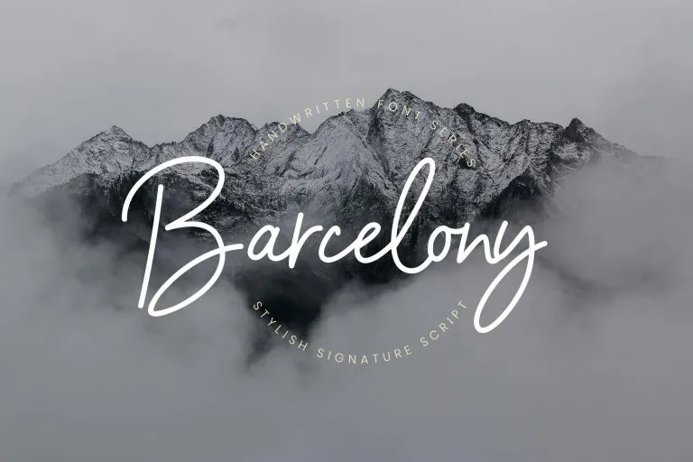
Barcelony is the most relaxed signature we make: a smooth, casual monoline with open bowls and gentle connections. It’s our third best-selling signature font on our own site.
The even stroke makes it easy to read and easy to reproduce, which is why we see it on travel blogs, cafés, Etsy shops and YouTube channels. A safe, friendly pick if Brittany feels too sharp for you.
Austin
by alphArtype
Austin is the most dramatic font in this part of the list. The capitals open with long horizontal strokes that sweep into the next letter, so even a short name fills a wide space.
That makes it great for a wide logo or a watermark across the bottom of a photo, and harder to fit into a square profile picture. Keep the name on one line and give it room.
Themysion
by Creatype Studio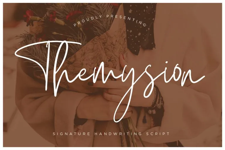
Themysion takes the tall-and-narrow signature idea further than anything else here. The first capital can reach three or four times the height of the lowercase, with long, straight strokes that look written fast and with confidence.
It works best for one short word: a studio name, a first name, a podcast. Give it plenty of vertical space in your layout, or the top of the capital will crash into everything above it.
Stephen & Gillion
by saridezra
Stephen & Gillion comes as three styles designed to be mixed, so you can build a signature with a different feel for the capital, the lowercase and the swash. It even has a heart-shaped connector for joining two names.
That makes it a natural fit for wedding photographers, planners and couples’ brands. It takes a bit more design time than a single-style font, and rewards it.
Evossry
by Creatype Studio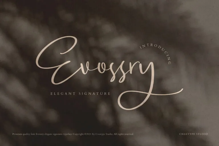
Evossry is a softer, rounder signature. The capitals have wide, looping entry strokes and the lowercase is relaxed but not messy, which gives it a quiet, high-end feel.
We drew it to sit next to an uppercase serif or sans, the way a jewelry or skincare brand would set its name. If you want “expensive and calm” instead of “fast and bold,” start here.
The Brands Quest
by Creatype Studio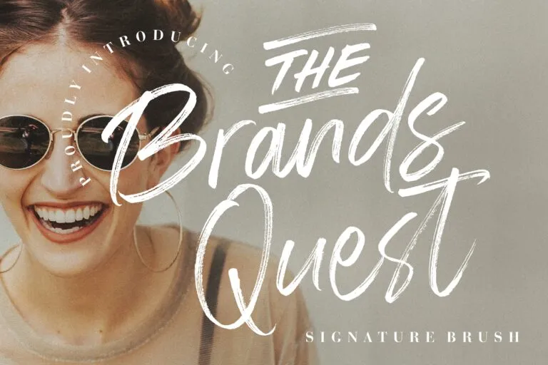
The Brands Quest is the boldest signature from our foundry: a heavy, dry-brush texture with visible bristle marks, plus alternates and ligatures. It reads clearly even small, and it looks great reversed out of a photo.
Use it for streetwear, YouTube channels, fitness brands and posters. It’s too loud for a law firm, and that’s fine.
Amatya Signature
by Aminmario
Amatya Signature is drawn to look as close to natural handwriting as possible: a quick, slanted pen line with no calligraphy contrast. That’s how most people’s real signatures look, which makes it convincing.
It comes with alternate and swash lowercase letters, ligatures and underline swashes, in regular and italic. Great for personal blogs, founders’ notes and email signatures.
Hallimun Signature
by Creatype Studio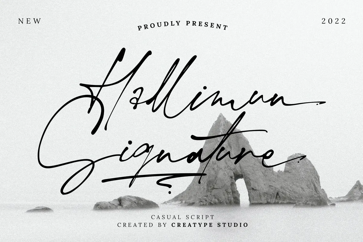
Not to be confused with our older Halimun script, Hallimun Signature is a casual signature with sharp turns and long swashes that cut under the whole word. It has a slightly vintage, editorial feel.
It works well for magazines, film titles and personal brands that want some edge. The swashes are a big part of its charm, so use the alternates.
Manly Signature
by Allouse Studio
Manly Signature is a monoline signature: one even stroke, open letters and plenty of space between words. It looks tidy without losing the handwritten feel.
Allouse Studio made it for titles, logos, packaging and branding, and the even line holds up well when printed small on a label. At $16 it’s also one of the cheapest picks here.
The Ballpoint
by Aminmario
The Ballpoint was made to look as close to natural handwriting as possible, and it does: the strokes have the uneven pressure of a real pen. It includes lowercase alternates, a lowercase swash set and ligatures.
It’s from the same designer as Amatya Signature. Pick The Ballpoint if you want it a little rounder and more relaxed. Also on MyFonts.
Savannah
by Creatype Studio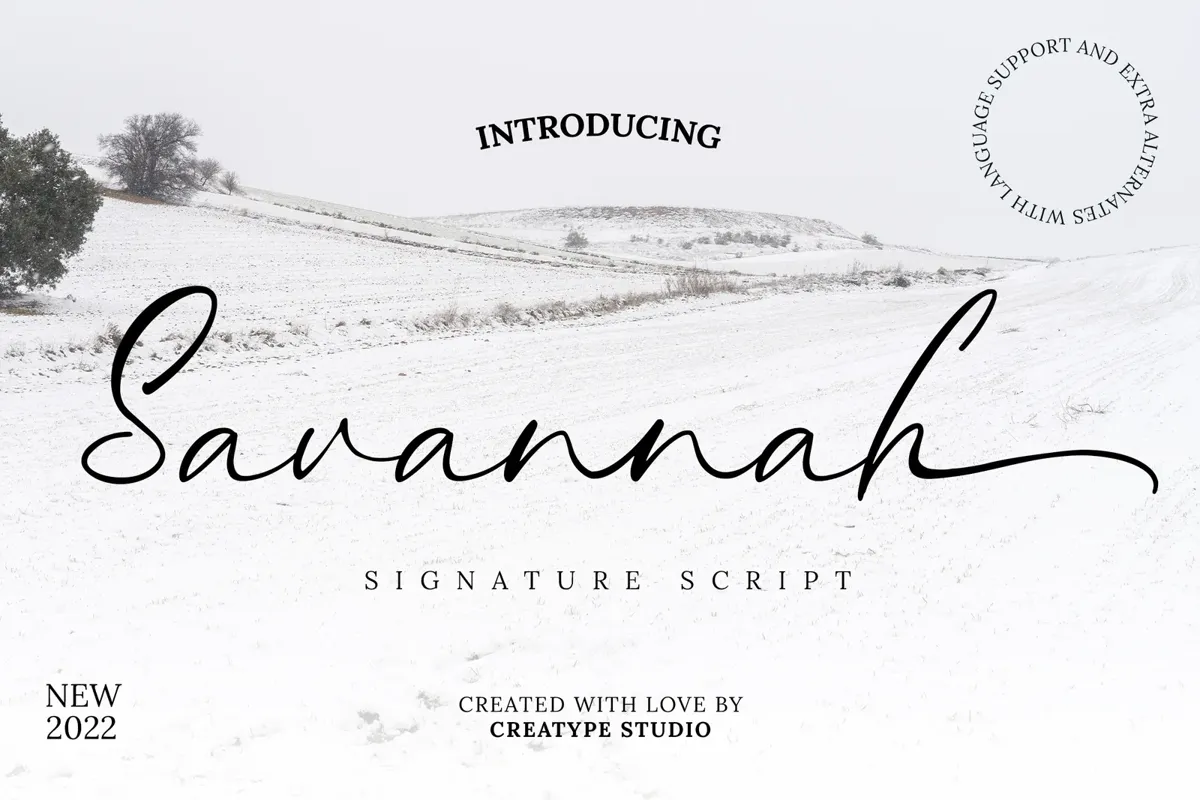
Savannah is the most readable signature font on this list from our foundry. The letters are simple and clear, without extra flourishes, and the long ending stroke under the name gives it the signature look without sacrificing legibility.
It also has extra alternates and broad language support. Choose it when people need to read your name at a glance: a shop sign, a YouTube thumbnail, a product label.
Brilliant Signature
by Arendxstudio
Brilliant Signature is a tall, narrow handwritten script that looks modern with a touch of elegance. It’s a single style, made for logos, brand names, posters and podcast covers.
At $18 for a desktop license on MyFonts, it’s one of the cheapest fonts here. The desktop license covers flat designs. A website needs the separate web font license.
Botterill Signature
by Aqeela Studio
Botterill is a flowing handwritten script with a very fine line and a classy feel, plus alternate glyphs, ligatures and swashes. It looks its best printed: stationery, greeting cards, wedding invitations.
The hairline strokes disappear at small sizes, so keep it large and skip it for a favicon. It’s on Creative Fabrica, so subscribers already have it, under Creative Fabrica’s license, which doesn’t allow registering a trademark.
Bellamy Signature
by Stringlabs
Bellamy Signature is a delicate, timeless handwritten script. The strokes are thin and the letters stand fairly upright, so names look calm and personal rather than rushed.
It suits wedding invitations, greeting cards and business cards, and works for a quiet personal logo. It’s one of the pricier fonts here on MyFonts, and the license is the foundry’s own, so check its logo terms first.
Autograf
by Måns Grebäck
Autograf has big, round capitals and a casual, bouncy lowercase. It’s friendlier and less “fashion” than most signature fonts, which makes it work for kids’ brands, food and community projects.
It’s the most expensive font on this list for a single style, from a well-known Swedish type designer. Check his license terms for logo use.
How to make a signature logo look custom
A signature font gets you 80% of the way. The last 20% is what makes it look like your signature and not the font’s demo image. This is also where most DIY logos fall short, so don’t skip it.
- Type your name and try every alternate. Most of the fonts above have several versions of common letters. Swap until the word has a natural rhythm.
- Fix the spacing by hand. Script fonts are spaced for average words. Your name isn’t average. Nudge letters until the joins look like one stroke.
- Add or shorten the tail. Many fonts include separate swash characters. A long underline swash is the classic signature move. Don’t use it if it makes the logo twice as wide as it needs to be.
- Convert to outlines and clean up. In Illustrator or Affinity, outline the text, then smooth any overlapping joins so it reads as one continuous signature.
- Test it tiny. Put it at 32 pixels wide, the size of a browser tab icon. If you can’t tell what it is, make a simplified version from the first letter.
- Pair it with a sans serif. A signature on its own can feel unfinished. A small, wide-spaced sans serif underneath (“PHOTOGRAPHY”, “STUDIO”, “SKIN CARE”) grounds it.
Before you buy, check the license
Every font above is a commercial font, even the ones with a free demo on ZingFont. The demo is for testing, not for your logo.
- On Creatype Studio, the Desktop license covers a logo you won’t register as a trademark. To register it, you need our Branding & Logo license.
- On Creative Market, the desktop license covers logos, but read its FAQ for the conditions.
- On Envato Elements, each download is licensed to one project, and you can trademark your design but not the font itself.
- On MyFonts, logo terms depend on each foundry’s license.
Not sure which one you need? Font Licenses Explained covers every license type, and Can I Use a “Free for Personal Use” Font in My Logo? answers the question I get most.
FAQ
What is a signature font?
A script font drawn to look like a quick, handwritten signature. They usually have a natural slant, uneven rhythm and long strokes at the start or end of words.
Can I use a free signature font in my logo?
Only if its license allows commercial use. Fonts marked “free for personal use” need a paid license before they appear in a logo.
Which license do I need for a logo?
Usually a desktop license. If you plan to register the logo as a trademark, check that the license includes trademark rights. Some foundries, including Creatype Studio, sell that as a separate logo license.
Do signature fonts work at small sizes?
Thin strokes can disappear on a favicon or a small label. Test the logo at 32 pixels wide, and pair the signature with a simple sans serif for small uses.
What font goes well with a signature font?
A clean sans serif in capitals with wide letter spacing is the safest pairing. A light serif works for luxury and wedding brands.
Was this helpful?
Thanks! That helps us decide what to write next.

Founder of Creatype Studio, a type foundry in Depok, Indonesia, since 2018. He has published more than 475 fonts, downloaded over 12 million times and used by brands like Unilever, Ogilvy and Epic Games.
More about Type Brief →